Now in its 16th year, the AIA Small Project Awards program—established by The Small Project Practitioners (SPP)—recognizes small-project practitioners for the high quality of their work.
The program also aims at raising awareness about the value and design excellence that architects can bring to projects, no matter their size or scope. Award recipients are categorized in three groups:
• Category 1 could include small project construction, an architectural object, work of environmental art or an architectural design element that costs up to $150,000 in construction.
• Category 2 could include small project construction that could cost up to $1,500,000 in construction.
• Category 3 could include small project construction, an architectural object, work of environmental art or an architectural design that is under 5,000 square feet.
Here are the 2019 Small Project Awards winners by category (text and images courtesy AIA and the credited photographers):
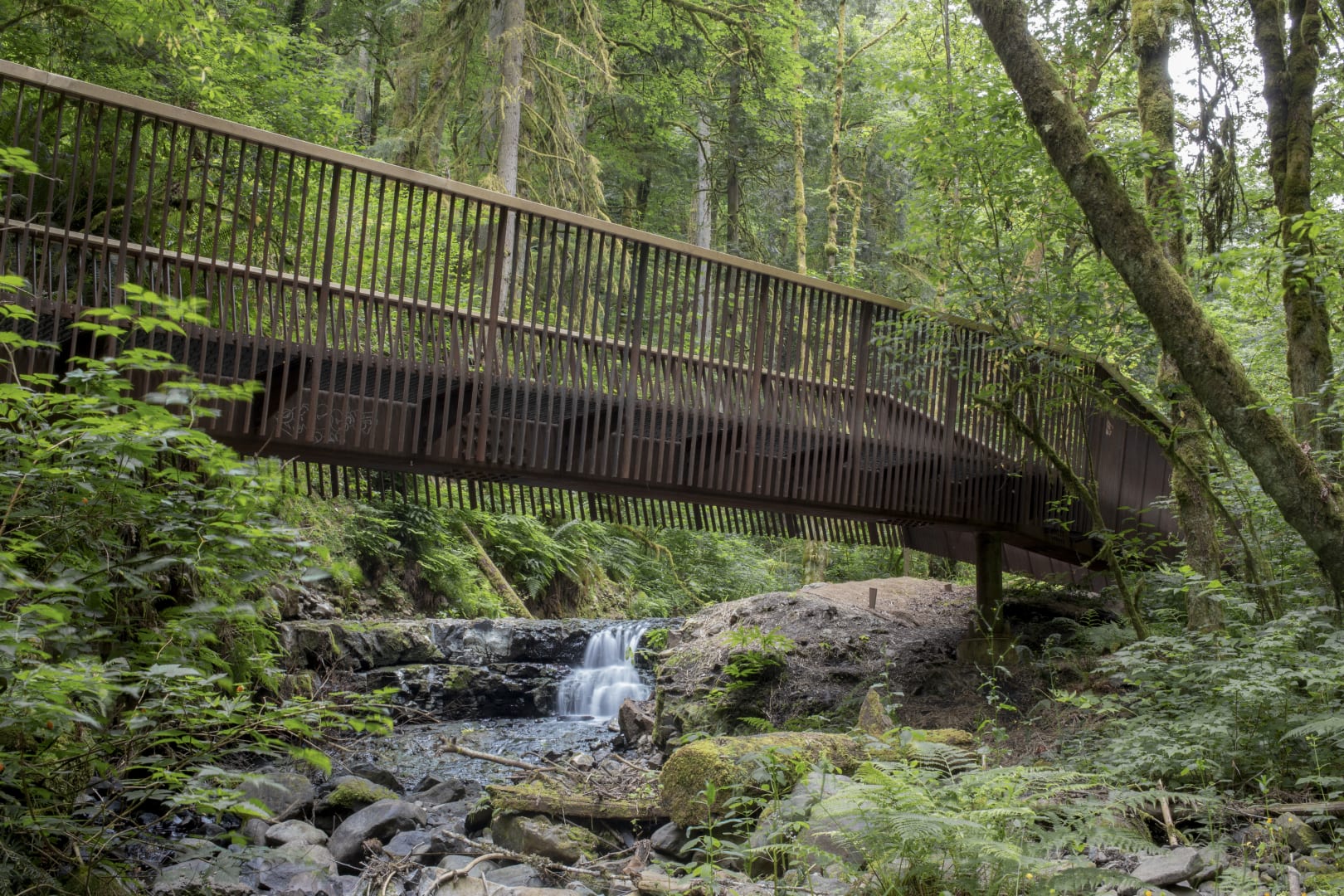
Located in Forest Park in Portland, Oregon, one of the largest forested urban parks in the country, the project consisted of providing durable, scalable, and safe replacement bridges for three popular and beloved hiking trails. The design team created bridges made of 4’ modular components that can be brought to the site by hand, minimizing site disturbance and tree removal in this sensitive environment. Weathering steel structural components are highly durable and patina to tones that blend with the organic colors of the surrounding context. Taking inspiration from the verticality of the native Douglas fir groves of Forest Park, the vertical slats of the bridges emphasize views from the bridges up and downstream, and to natural environment beyond. Further enhancing the views, the railings are angled away from the path, inviting children and other users to pause, lean against the cedar handrail, and watch the moving waters below. Photo: Caleb Couch
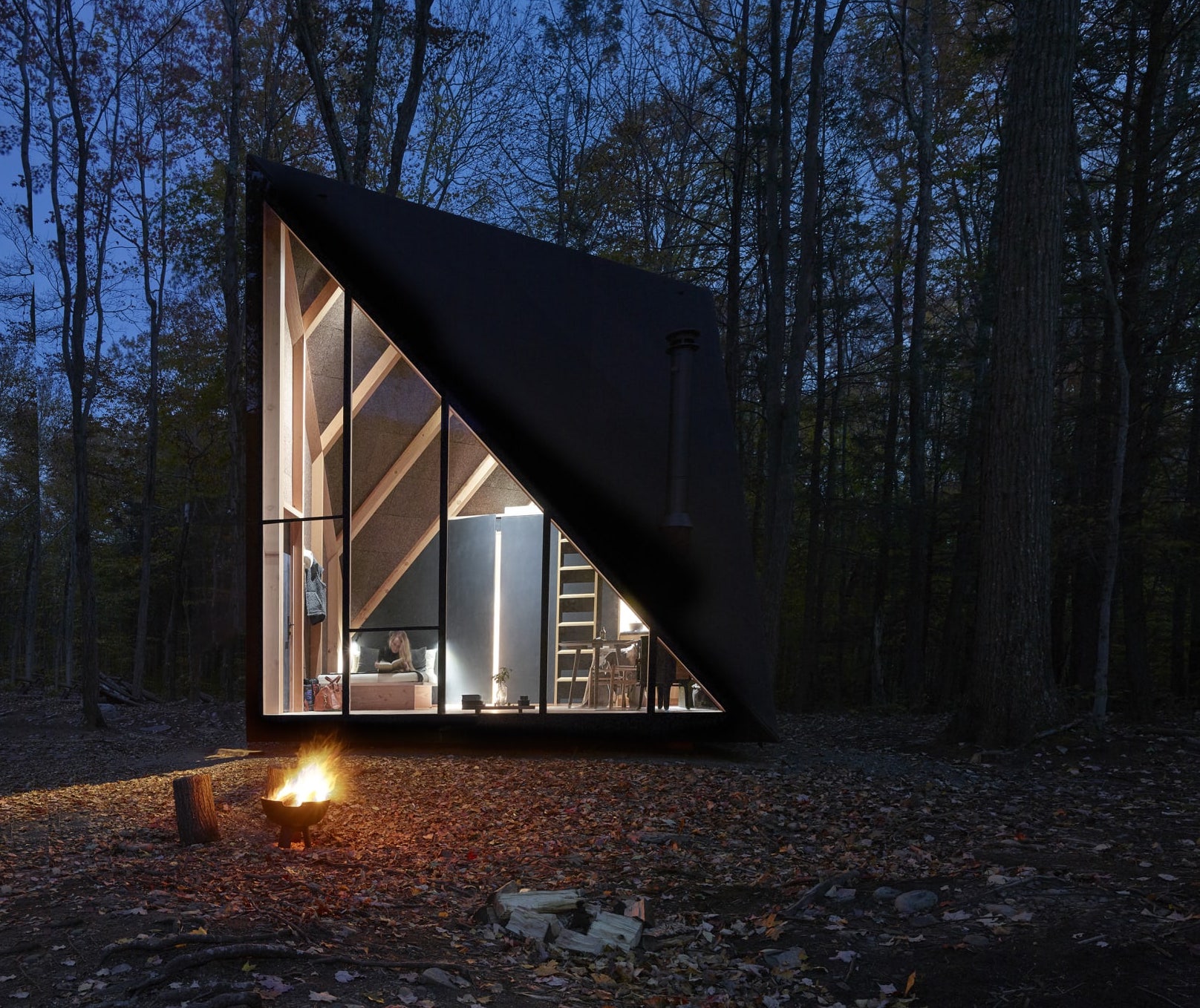
Klein A45 is the first prototype constructed in New York and will be entirely customizable for home-owners to purchase, tailor and have the tiny house built within 4-6 months in any location, for any purpose. The design evolves from the traditional A-frame cabin: A45 increases usable floor area by taking a square base and twisting the roof 45 degrees to raise the tiny home to a soaring 13ft height. Upon entering, the 180sqft interior space reflects a minimal Nordic abode: from the Douglas Fir floor to the insulating natural cork walls, A45 brings nature inside. An elegant Morsøe wood-burning fireplace, a petite kitchen by Københavns Møbelsnedkeri, hand-crafted furniture from Carl Hansen and a bed fitted with Kvadrat fabric designed by Soren Rose Studio adorn A45. The bathroom is made of cedar wood with fixtures by VOLA. A45 is assembled in modules on site and consists of 100% recyclable materials. Photo: Matthew Carbone
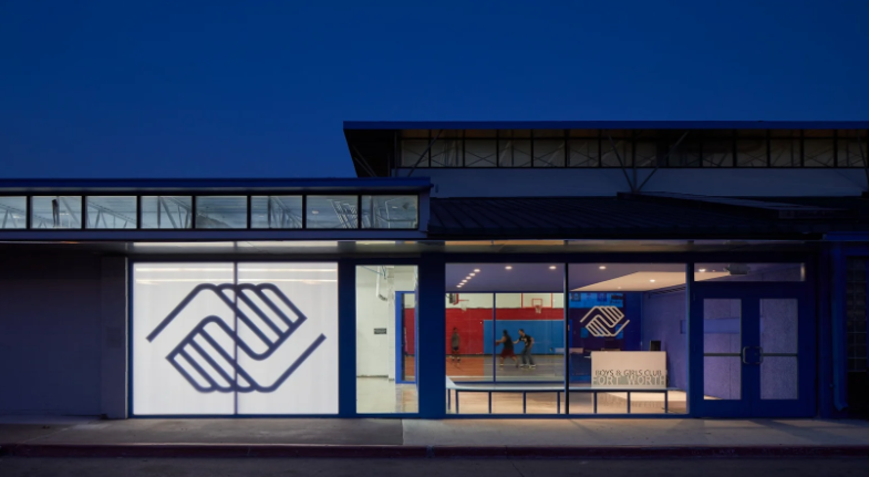
The design invites people through the new glazed entrance, pulling them toward a friendly face. As families enter, they can now see the activities available to their children. Steel benches and a laser-cut steel desk are powder coated and topped with solid surface, while painted tectum panels provide acoustic relief. These materials provide durability without the “heaviness” of the original building.
The white elements on blue create a strong sense of brand that breaks through the banality of the structure. At night the elements reach beyond the footprint of the building creating a strong visual presence in the neighborhood.
There is a layer of meaning folded into the form. The aluminum entry canopy is a visual symbol of the children whose life paths have been altered by the Boys and Girls Club. The plane of the canopy is interrupted by holes, allowing the sun to beam points of light in the afternoon. Each year, one hole is drilled for each child who completes their college preparation program and goes on to college. Every day children, staff and parents walk underneath an aluminum plate shade canopy at the entry to this branch, the points of light falling over them as they walk.
As the years pass the sense of inspiration will grow as children walk beneath a canopy emitting more light with each passing year… As the organization’s impact plays in the light on their doorstep. Photo: Dror Baldinger
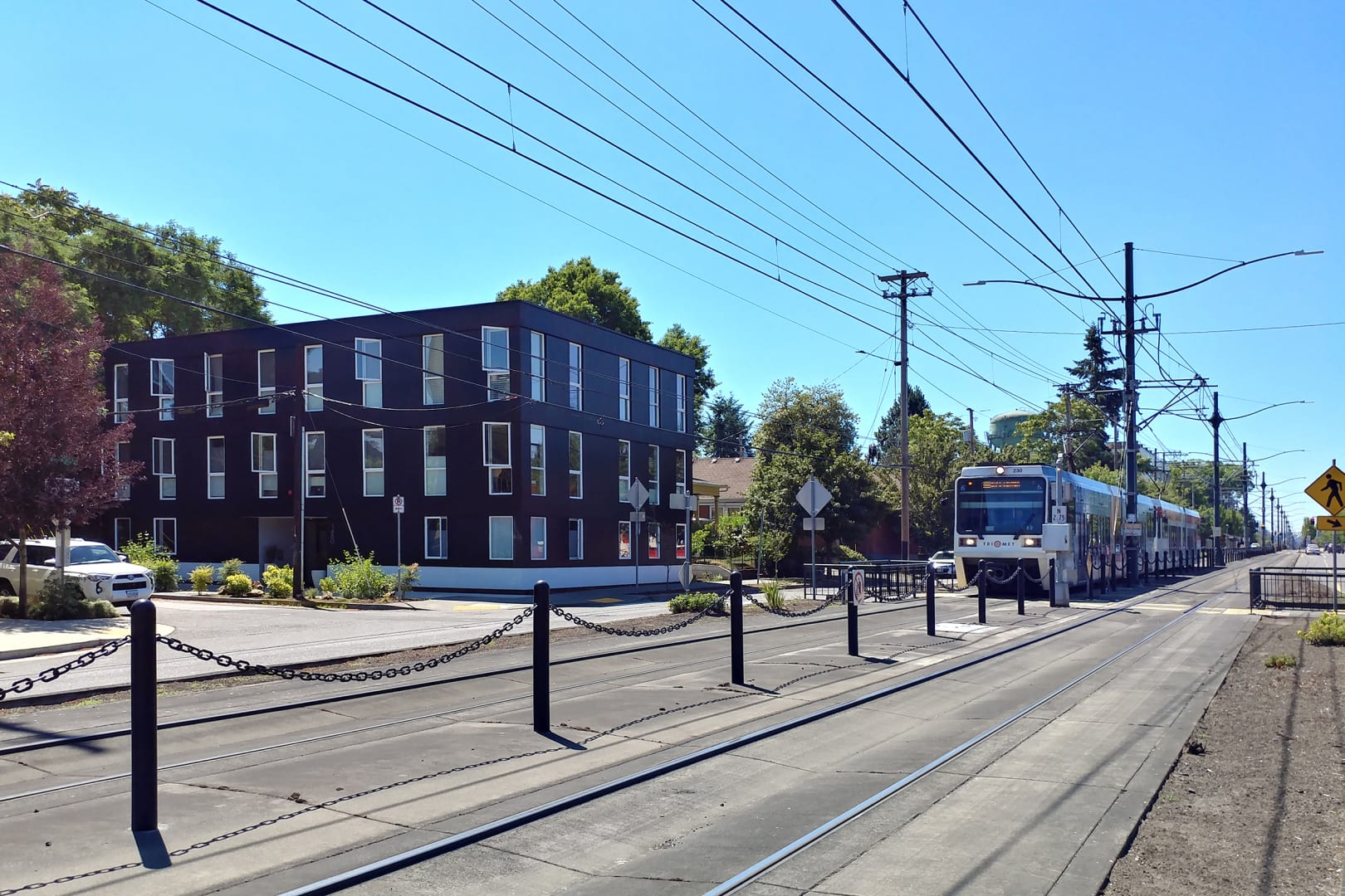
The Jarrett Street 12 is located in north Portland along the MAX light rail line. The project is a 7,200 sf, 12-unit affordable housing project. The units were all offered at below market prices through the City of Portland SDC Exemption Program that assists developers by reducing their development costs in exchange for building affordable, for sale, residential housing. The simple massing is a response to the site and zoning constraints. The overall site area is a mere 3,900 sf. The building is comprised of three 2,538 sf floors with 4 units on each floor. In addition to the highly efficient planning, the project utilized modular construction which reduced construction time and budget. The building’s design is marked by an overlapping cladding detail that gives a subtle stratified appearance to the building’s massing. The result is an innovative development that helps address the city’s affordable housing crises. Photo: Photo: Architecture Building Culture
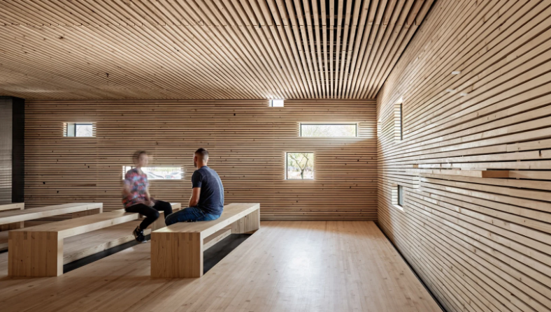
In 2017 the leadership of Redemption Church challenged debartolo architects to design a space dedicated solely to prayer. It has been said that, “Prayer is bringing our helplessness to God.” For hundreds of years spaces and places have been specifically designed to foster one’s intimate communication with God. In contrast to the machined, extraverted quality of the existing building in which the space resides, the prayer space is modest and reserved. The intention was to feel ‘made’, more than ‘manufactured’. To achieve this, common douglas fir 2×4’s were selected as the principal material for its raw presence, warmth, and economy, a single material that could function as floors, walls, ceiling, and benches. One ordinary material, with thousands of imperfections, made into something extraordinary when unified. Analogous to the church, each person is a unique expression of God, however when unified, the whole becomes more beautiful than the parts. Photo: Roehner + Ryan
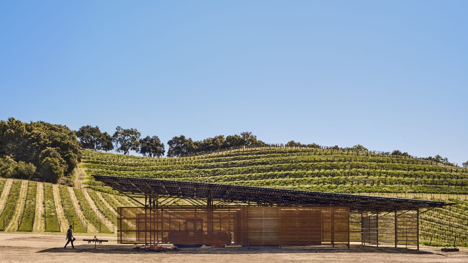
Located in the Templeton Gap area of Paso Robles, California, this simple agricultural structure rests at the toes of the 50 acre James Berry Vineyard and the adjacent winery. Sitting sentry as the foremost structure present upon entering the vineyard lined property, the barn and its renewable energy system speak to the winery’s commitment to sustainability and subservience to the natural landscape. Imagined as a modern pole barn, the reclaimed oil field pipe structure provides an armature for a photovoltaic roof and covered storage for equipment, workshop and maintenance space, and storage for livestock supplies. Utilizing a laminated glass solar module system as both the actual primary roof and the renewable energy generator, offset any additional costs to construct an additional roof. Minimalistic and salvaged materials were selected to withstand the particularly dry climate, for regional availability, long-term durability and to minimize the need for regular maintenance. Photo: Casey Dunn
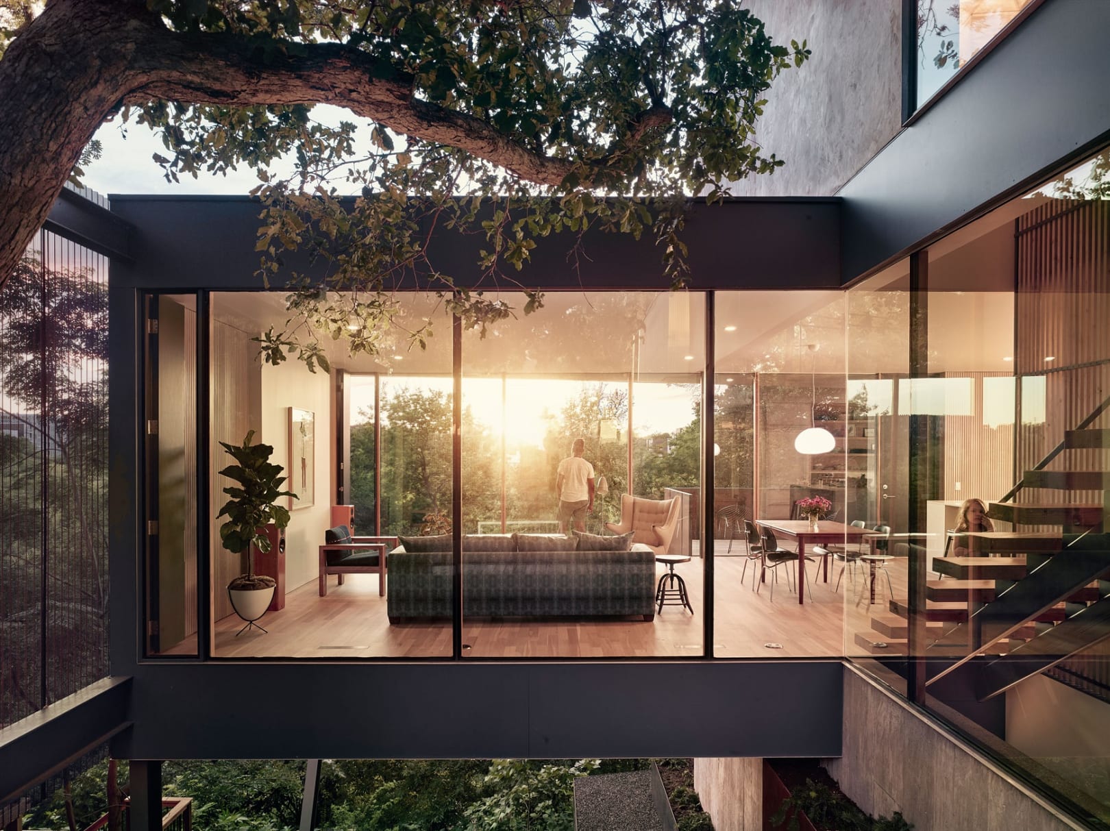
The South 5th Residence slips nonchalantly into Austin’s eclectic Bouldin neighborhood and deftly negotiates Austin’s zoning, envelope and critical-root-zone requirements. A rare, 25″ durand oak and an unexpectedly steep escarpment created a powerful circumstance for a house that emphasizes view and a dynamic spatial sequence, while at the same time being an abstract backdrop for the serendipity of light and circumstance. The visitor arrives into a verdant courtyard under the majestic oak. A thin, 4” gabion wall at the street, evergreen plantings and a perforated, Cor-ten corrugated screen to the south, provide varying degrees of privacy and animation for the ensemble. A transparent living room hovers over the tumbling escarpment and reveals an expansive panorama. The visceral textures of concrete, mill-finished steel and raw stucco are presented against finely detailed millwork and custom site, glazed window walls, which are framed with rift-sawn white oak and steel to form flitch plate mullions. Photo: Casey Dunn
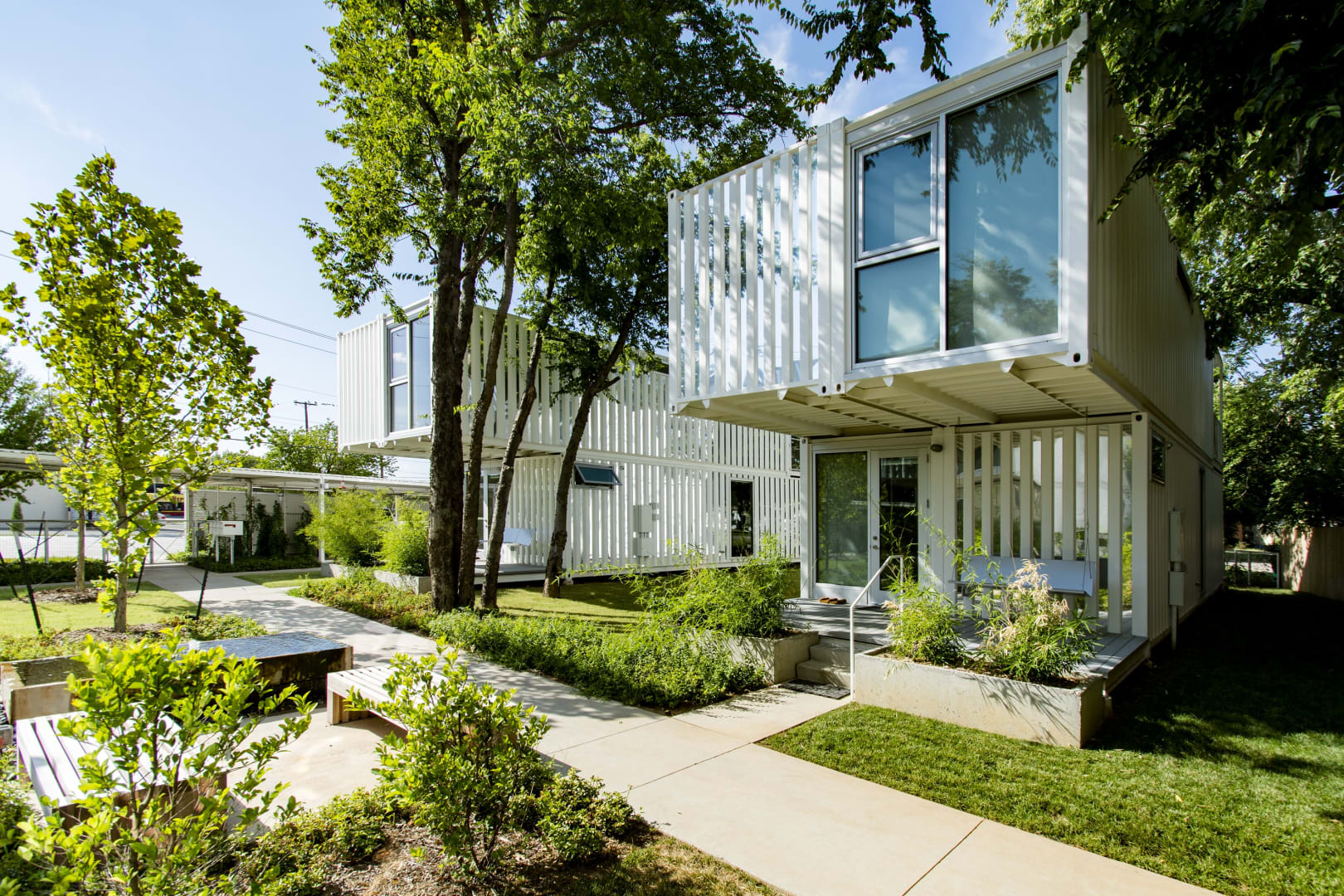
Responding in a sensitive and sustainable way to Oklahoma City’s imperative to increase density in existing residential neighborhoods, Squirrel Park makes innovative use of modified shipping containers to create four single-family homes. Each offers around 1400 square feet of living space, its unconventional interior layout contrasting with the modern, industrial exterior aesthetic. The design reinterprets the components of a traditional neighborhood street on a smaller scale, encouraging outdoor living and interaction. The unique nature of the site as a park-like environment will be enhanced through retention of existing mature trees, provision of shared outdoor spaces and new planting, and the addition of green roofs to assist energy efficiency and biodiversity. Photo: Eric Schmid
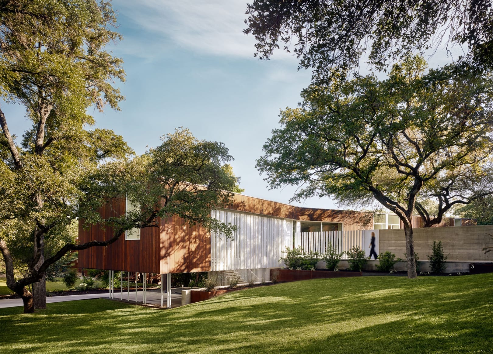
The Sugar Shack Residence slips between a dramatic ravine and an intimate courtyard, both defining and accommodating its adjacent circumstances. Organized linearly, interior spaces negotiate between these two powerful conditions of landscape, and embrace their very different characteristics. A Cedar-clad volume, treated in the traditional Japanese Shou Sugi Ban, is set perpendicular to the street and hovers above the landscape. The visitor enters in the middle of the house where an exterior, glass-enclosed stair penetrates the volume from a carport tucked into the hillside below. Windows direct one’s gaze strategically into the tree canopy or towards the private courtyard and align with the edges of the building, alternately sliding below the floor or above the ceiling. Careful attention to detail is ubiquitous and abstraction is utilized to focus attention on the subtlety of light, material and circumstance. Here, mill-finished steel & board-formed concrete is set against purpose-made, fumed white oak cabinetry and floors. Photo: Casey Dunn
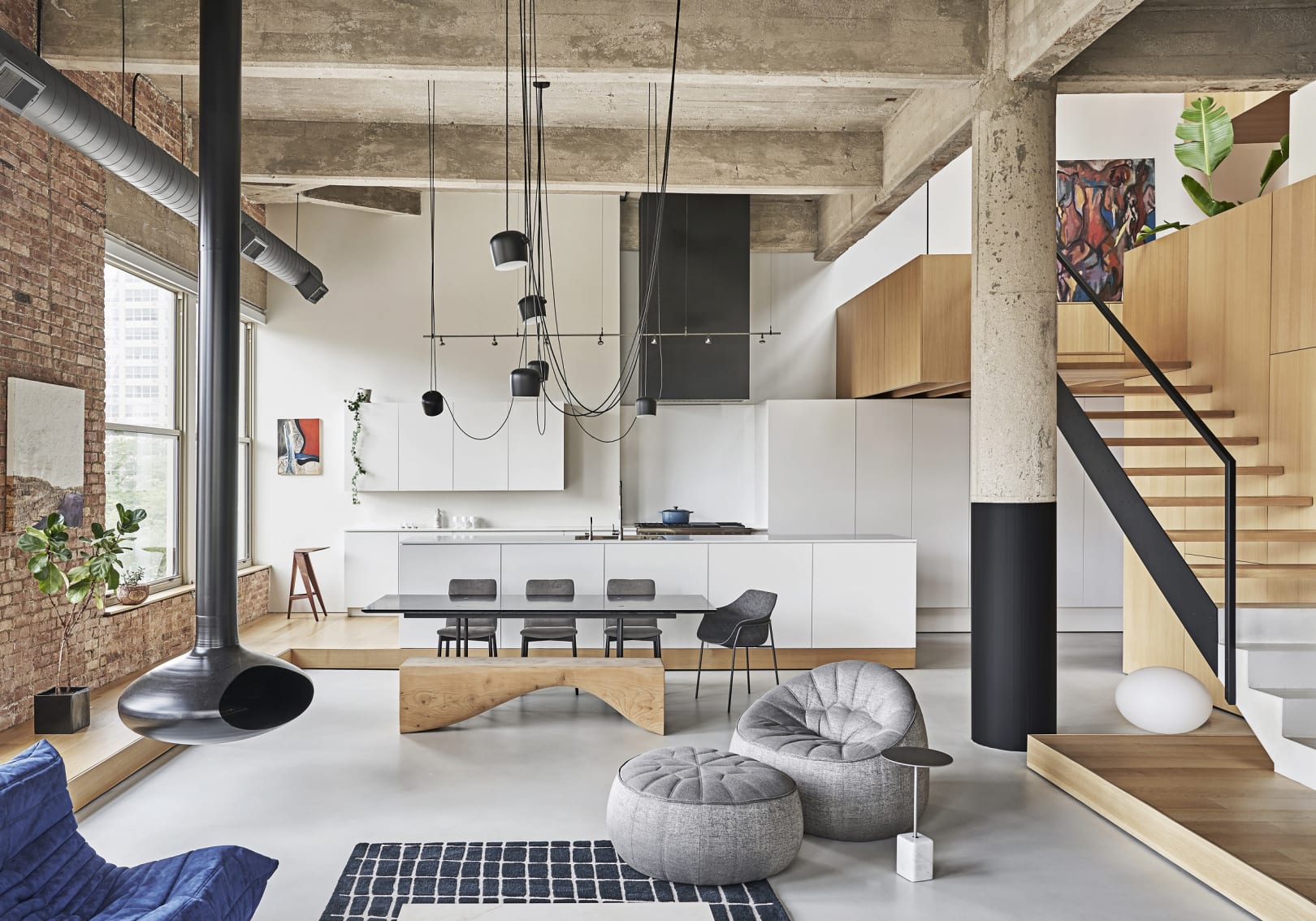
Inside a century old structure initially built for automotive assembly and display, we renovated a residence that was poorly functioning as a domestic space. Scaled architectural components, material restraint and theatrical lighting, lessens the overall spatial dominance, while openness and clarity of space is maintained. The continuous wood platform organizes the vastness of the open room, providing an edge for more intimate furniture arrangement and a designation for objects on display. Clad in steel, the sleeping cube is situated away from the perimeter for greater noise and temperature control, it’s a visual anchor that transforms, revealing one of many uses contained within. As one moves between the meandering levels, a variety of unexpected views and conditions are revealed, bringing the homeowners closer with the raw qualities of the industrial raw cloak that is their home. Photo: Mike Schwartz
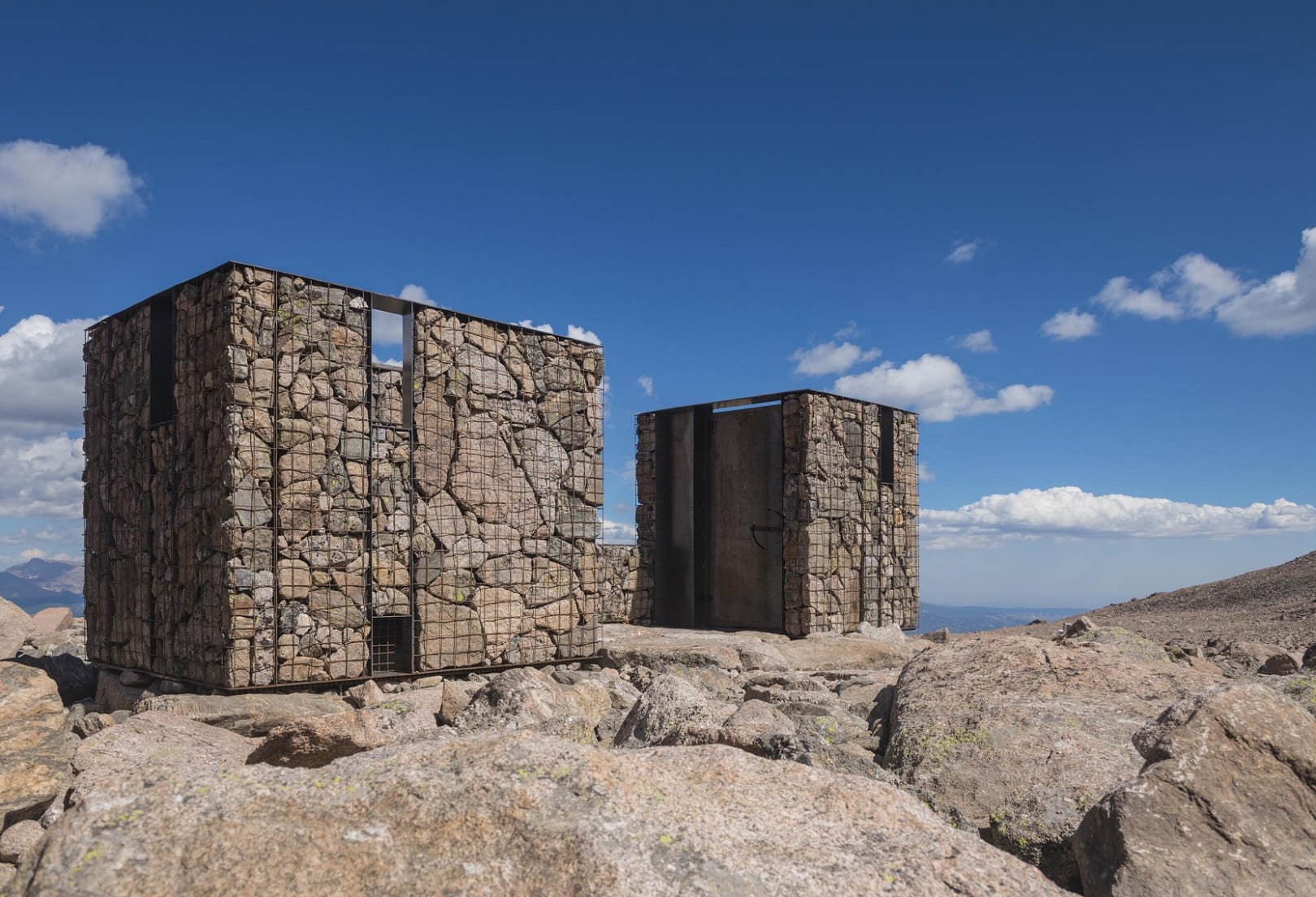
Determined to find a better privy design, and a more humane solution of collecting waste, the National Park Service collaborated with ColoradoBuildingWorkshop, the design-build program at CU Denver, to re-design and construct new backcountry privies. The new Long’s Peak Toilets explore lightweight prefabricated construction and emerging methods of waste collection to minimize the human footprint in Colorado’s backcountry. The final design solution is a series of prefabricated structural gabion walls. Within the gabions, a series of thin steel plate moment frames triangulate the lateral loads within the structure while stones, collected on-site, are used as ballast. This innovative construction assembly allows for rapid on-site construction (the project was erected in eight days) and an architecture that disappears into the surrounding landscape. Photo: Jesse Kuroiwa
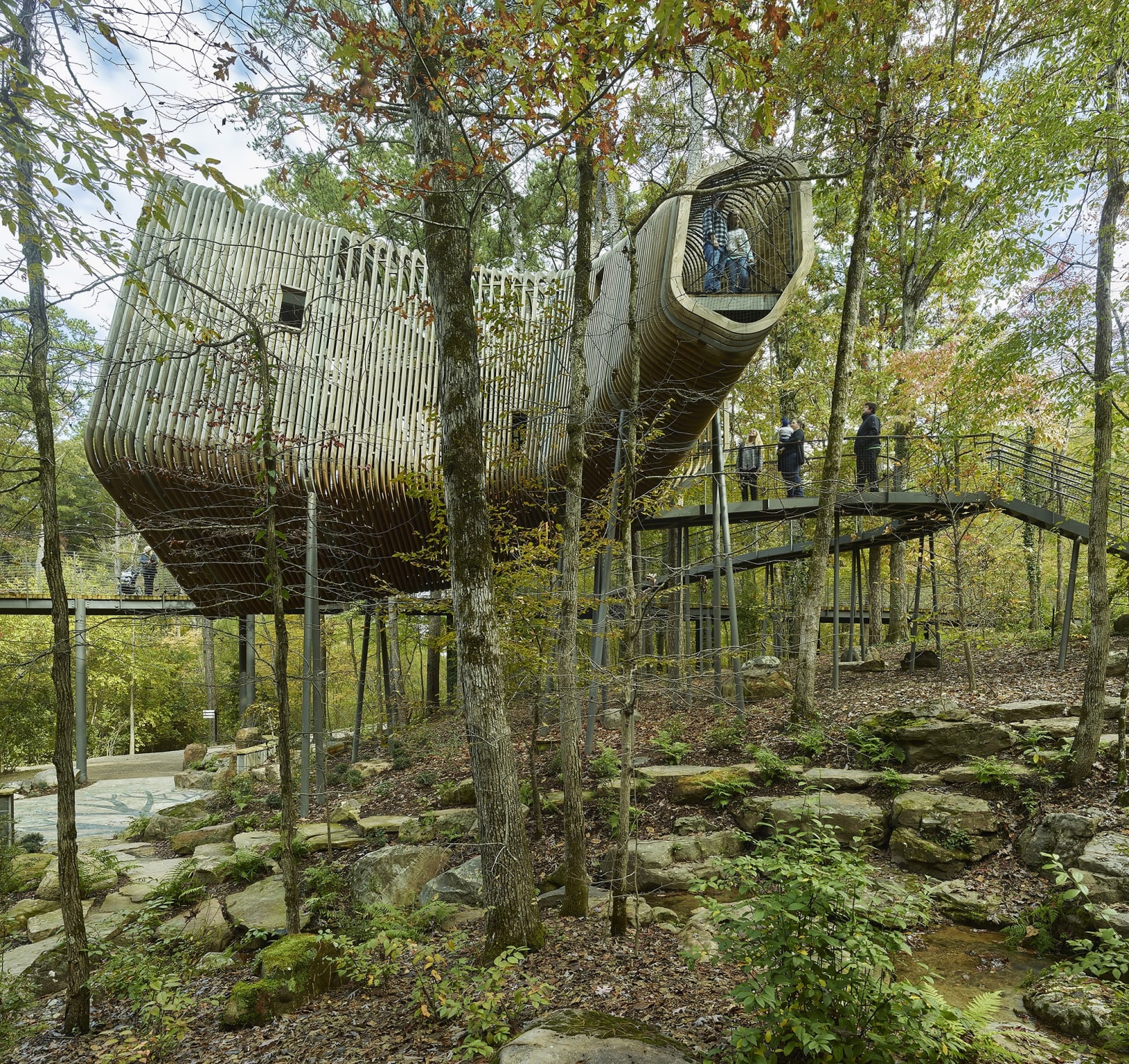
Nestled in a natural Ouachita Mountain hillside along Lake Hamilton at Garvan Woodland Gardens in Hot Springs, Arkansas, the Evans Children’s Adventure Garden welcomed a new tree house to the grounds that will provide an interactive educational experience for visiting children as part of an ambitious plan to bring children back into the woods. This unique structure is a defining small project for the design team. From design to fabrication, they were able to merge their childhood-earned knowledge of the natural world with their hard-earned think, make, do philosophy. The underlying theme of dendrology drives both the form and program of the structure. The 113 fins comprising the thermalized Arkansas-sourced Southern Yellow Pine screen creates a semi-transparent and an evocative form dynamically shrouding multiple levels of spaces for children and adults alike that refocus attention to the natural wonders of the forest canopy. Photo: Timothy Hursley


