Interior design involves a lot of strong aesthetic sensibilities and psychology, often related to color. Working in tandem with the client, the designer is responsible for creating the concept, the mood, and shaping the user experience. Color is key in generating the feel, the tone, and telling the story of a space. Often when united with different materials, color can communicate a strong and compelling impression, attracting or repelling different individuals, depending upon the target audience.
Some of the strongest sensory associations with color can be transmitted with a single hue. For example, red is powerful, strong and heavy, while yellow can communicate trust, optimism and lightness. High-intensity shades can elevate energy and attract attention, while those that are cooler and darker – generally blues and greens – can evoke feelings of calm in a person moving through a space.
Orange is bold and energetic, while violet or purple can be heavier, sweeter, and more languid. Because so many different signals are broadcast through the use of color, it is important to be aware of the purpose of the space. A hotel, for example, can be entirely transformed, depending on the narrative it wants to present to potential guests. Lots of red and dark colors can give the space a dramatic, decadent, and powerful feel, while a more monochrome design can indicate peace, relaxation, and calm.

When used with different materials, color takes on another dimension; the final, unified effect can bring a certain ambience to a space. This ambience is further established and amplified when colors are directly applied to different surfaces and materials, adding unique textures and style.
“Materials complement the mood of the space and work in harmony with color,” says Bill Beaudreau, President, CRB Interiors. “Color can also be part of the materials used as well.”
Back-painted glass is a unique way to bring color into a space, unite materials, and allow for a distinct interplay between a surface and the selected hue. “It produces a very evenly-controlled color application with a very consistent high sheen,” Beaudreau says. “It exudes a glamour and richness no matter the color choice.

Different finishes are possible with different back-painted glass products. For example, AGC Glass North America offers glossy Lacobel T® a temperable back-painted glass, which is a float glass covered on one side with a high-quality paint. On the other hand, its Matelac™ T glass product is temperable acid-etched and back-painted to achieve a satin finish.
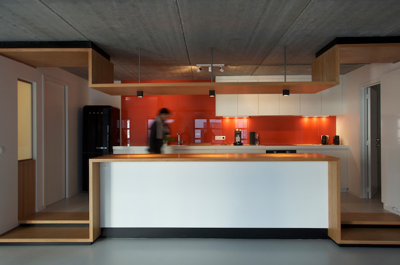
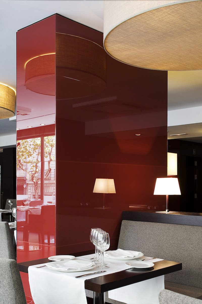
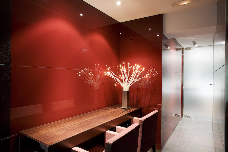
Back-painted glass has a wide range of applications from tabletops, to wall coverings, murals, shelving, sliding doors, and partitions. It can be featured as a kitchen backsplash, bringing a bold or muted focal point to the room, or serve as a wall covering to provide a stunning, inviting backdrop to the main room of a restaurant.
Color is a powerful tool in interior design, and combined with innovative applications, such as back-painted glass, it sets the stage for beautiful, compelling spaces.


